


Newspaper to be displayed (2018)
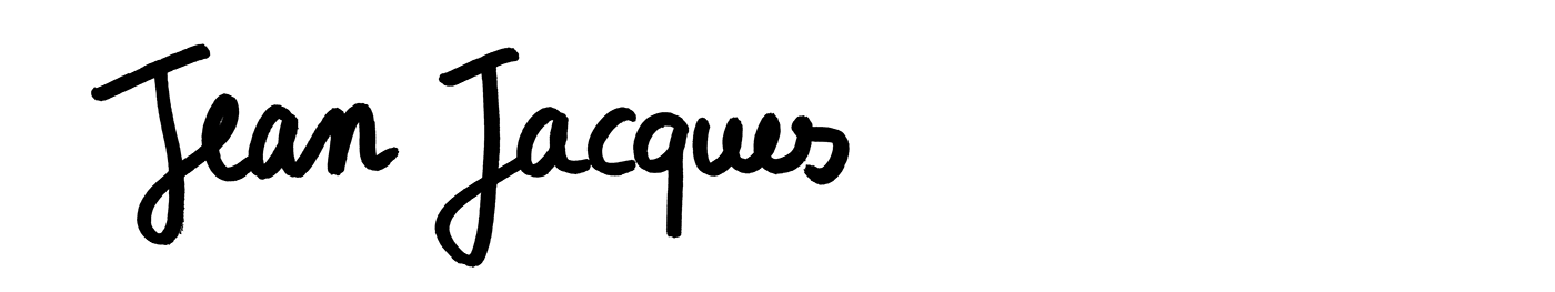
In pairs, we had to design a displayable black and white newspaper in A0 format using at least 5 different fonts or letterings. Its purpose was to highlight excerpts from Rousseau’s essay Du Contrat Social. Because of the difficulty of the text, we tried to make it more reachable by easing its reading. We experimented different ways of processing the images and the text, so that they would attract the eye and surprise the reader. We also searched for an understandable folding for the newspaper, to make it interesting both folded and unfolded. Finally, we agreed upon a poster where the titles of the chapters and the highlighted excerpts are written by hand. It enabled us to add personality and proximity towards the readers. The ripped images and abstract forms give rhythm and dynamic to the composition of the poster. The title, Jean Jacques (Rousseau’s first name) reflects the proximity we wanted to create between the text and the reader.


Project made with Ambre Senlis.
Photographs: Jean-Charles Queffelec
Fonts: Helvetica by Max Miedinger, Work Sans by Wei Huang, Raleway by Matt McInerney, Times New Roman by Victor Lardent and Stanley Morison.


